Thursday 26 April 2012

Front Cover, Contents page and Double page spread - finish.


Evaulation

Music Magazine Evaluation
For my AS Foundation Portfolio Production in Media studies I created a Music Magazine called ‘MUSIC4LIF3’ this consisted on creating a: front cover, contents page and a double paged spread. To do this I had to learn the conventions of a music magazine; I started to look at the magazine conventions and the layout used on previous music magazines: NME, Kerrang, and XXL, this gave me a better understanding of where everything had to go and the terminology used for each convention. The conventions are the same for all music magazines so to make mine as realistic as possible I followed the same conventions. Although not all the music magazines I looked at where related to my original genre, I wanted to compare and identify the differences between them and how and why the colours and images are used to attract a specific target audience. My genre was hip/charts because it’s what I know the most about and would make the project more interesting for me.

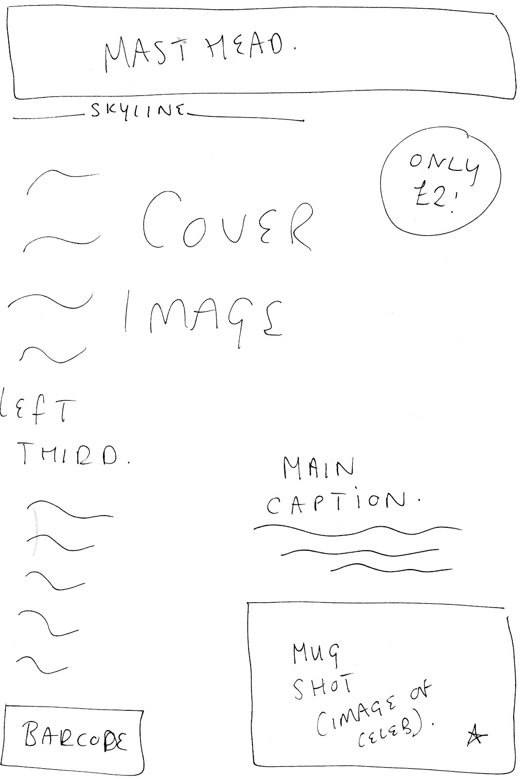
1.       In what way does your media product use, develop or challenge forms and conventions of real media product?
http://prezi.com/tw6-2h_mc3u9/present/?auth_key=enaoe77&follow=JessicaGowans - Magazine conventions: Front Cover (When on prezi – click ‘SHOW’ bottom right corner)

Magazine conventions: Contents page...


Only two images are used on the example I’m using, and I thought this was better than over crowing it with pictures because it gives away what is actually in the magazine. So I decided to use a minimum amount of images as possible so the main part of the contents page is the contents. The colour scheme carries on throughout into the double page spread and the contents page. In the process of making my contents page originally it was on the right hand side just like my template. However after feedback I got told to move it to the left hand side and place my images on the right. I loved the idea on the content page ‘base’ with the numbers not 100% in line with the features. Also I thought it would look better by adding my own little twist and making the contents different fonts and sizes. The colours used are relativity the same: red, black and white. To make my contents page look at realist as possible I included the page number in the right hand corner. [4]
Magazine conventions: Double Page spread...


LARGE headline. Although my double page spread headline is bigger than the example, the format is very similar.
Names in 'WHITE' - GOOD GIRL GONE BAD
WHITE' - BAD GIRL, FOR LIFE!
To make my magazine as realistic as possible I used ‘Pink – Good girl, For Life!’ as my example.
The beginning paragraph is an interview with Pink. - Rock rebel: Everyone's talking about your parodies of Paris, Jessica, Linsay and Mary-Kate, but 'Stupid Girls' is about more than that isn't it?
My beginning paragraph: Did anyone support you?
To be honest, no. My parent thought I was chasing a never ending dream; however they knew I could sing, but didn't think I'd get anywhere doing it! Which made me start to doubt, myself? Friends didn't think it was worth telling. They would have thought I was silly, so I kept it to myself.
I started my double page spread with a question also. I think this is really effective when reading about a singer you likes' life. So I used the whole double page spread article as a template and made it into an interview about how she got where she is in life now. Writing m article was the easiest part about my double page spread because when watching celebrities being questioned, the questions asked as simple and they don’t plan out what is going to be said, they answer the questions there and then, therefore I made my article as realistic as possible by using this method. I included quotes from her parents to show what she was like at a young age. Again relating back to my target audience as young adult wanting to know how she did it and being inspired.
Because the image is normally the first thing people look at when reading a double page spread, I think it's very important the image is taken up a lot of the page - also making it look like there isn't that much to read so the audience don't think they’re going to be spread forever reading an article they may not enjoy.
The image used in Pink’s double page is really effective. The mise en scene gives off the impression she is a bad girl. Linking back to her album cover 'Bad Girl, For Life' her clothes link in with the colours used on the article: pink and black. Pink symbolises innocence and feminine however the black contrasts because it symbolises power and dominant, rock and roll. Creating the impression she is a bad (black) pink (girl)
Neither of the texts includes a by-line of the photographer, or the journalist who wrote the article. The caption on my double page spread is a little teaser about the artist represented. Pink's caption is actually about her album, however I've wrote mine about Lauren a little interesting fact about Lauren.
2.       How does your media product represent particular social groups?
Because my image is taken in a bar it clearly shows it’s for the younger adults, however stereotypically teenagers are drinking and attending parties more and more underage which widens my target audience. The clothes she is wearing shows the audience she has spent time making her look this good. The media is known to overwhelm reader’s views and convincing them to believe everything they read in magazines; and want to look more and more like celebrities, so what she looks like is crucial because the image is the main attraction of a Music Magazine. The contents on the front cover should say something they feel they can relate to due to their social group/scene. Additionally, I included a well-known rap artist: Usher. This again symbolizes the youth of the magazine and makes people who like Usher want to read the magazine he is in.
3.       What kind of media institution might distribute your media product and why?
From previous research on the IPC media institution they market their magazine at three main audiences; men, upmarket women and mass marker women. Therefore this company would not be a good institution to publish my music magazine. However this could be an okay one to publish my magazine because it attracts women. However I want my audience to be as big as possible.
The next company I researched was Bauer Media Institution. This company owns over 80 published magazines. This would be perfect to  use to publish and promote my magazine because ‘Kiss’ radio station is involved and this is where the music I used for my genre is played. RnB, hip-hop. Kiss Reaches 3.7 million listeners across the UK, giving them all of the best in dance, hip hop and R&B on radio, TV & online.
FHM is the UK's biggest men’s lifestyle media brand and the PPA’s International Magazine of the Year 2008. The magazine is the standard-bearer among British men's magazines. www.greatmagazines.co.uk was launched in 2003 and has since established itself as the Number 1 magazine subscription website in the UK.
4.       Who would be your audience for your media product?

My original plan has always being the same when planning my target audience; young adults. I understand a lot better because I have the mind of a teenager and I’m more liking to know what a young adult would want in a magazine rather than an older person; person(s) used for the image has to be strictly young; colours used and language used needs to be not too formal, but includes a little in formalness too, most young people now days tend to have mobile phones and use social networking sites and over time new language has developed. Stereotypically students and young adults are lazy. Therefore when typing becomes a chore we tend to use shorter terms for words. For example we used numbers for letter: for = 4, to = 2. Every day saying such as oh my god: omg. Atm = at the moment. Sayings are being reproduced rapidly therefore I thought it was a great idea to include a bit of slang into my masthead to show it’s clearly aimed towards the younger generation because older people don’t understand how to use technology as much as the younger generation. This is why I decided to put a little slang into my title, however not too much otherwise it would attract a target audience I don’t want too. ‘MUSIC4LIF3’
Again because my background image is taken in a bar and she’s also young tells the audience who this magazine is aimed at. The colours used are very sophisticated and dominant (red and black) 

5.       How did you attract/address your audience? I attracted my audience by researching what do teenagers actually enjoy reading? Well, not many enjoy reading a big amount. So if an article is written and it loads like a lot of reading its most likely they will avoid reading it. Therefore it’s best to make it look as little writing as possible, which relates back to the importance of the image. I wanted to make my image as professionally looking as possible and to do so I needed to do it somewhere better then at a College. Therefore I took the images in my own time, rather than in College time. The genre of my magazine is charts/RnB/hip-hop, and because it’s a music magazine it needs to relate to that. After watching many music videos with millions of hits on YouTube it shows what attracts people’s attention. Most are either women dancing in clubs/bars or popular singers such as Chris Brown, Sean Paul, 50 cent, Pit bull being danced upon, stereotypically telling me that’s what attracts viewers’ attention, so my front cover and double page spread and to be classy to attract my audience but appropriate.

6.       What have you learnt about technologies from the process of constructing this product?
The software Photoshop was used when creating my magazine covers. Publisher was used when creating templates for my double page spread, front covers and contents page. Microsoft publisher was so much easier to use for me because before Wyke I never had a clue how to use Photoshop but after practicing for a long time I managed to just get the hang of it. Lucky I never had to edit my image too much because the photograph was a good image. No red eye removal or spot fix. However I used a variety of fonts and layers within my cover. I raised the contract of my image to make the image a bit lighter a used the sharp tool to make her face look clearer.  At the beginning I cut around my image getting rid of all the background but because the back ground was black as well as her outfit, Photoshop had trouble figuring out which bits I wanted to get rid of. Moreover I scraped cutting her out and used the full image. I think this was a great choice to use.

7.       Looking back at your preliminary task, what do you feel you have learnt in the progression from it to the full product?

My preliminary task was to create a college magazine. My full product was creating a music magazine front cover, double page spread and contents page. Comparing the two pieces of work to what I know now and what I knew then; I have learnt so much more. When making the College magazine I didn’t know the importance of making a magazine other than it had to look good an appeal to a target audience. However when researching into different magazine covers and how professional each one looked, I realised there in a lot more to it than just having a specific target audience. When looking at a music magazine front cover, I instantly looked at the image. If the image does not appeal to me then it would be very unlikely I would consider buying it. I make it my main task to find an image to take which would make my music magazine represent a genre and tick all the boxes. On the other hand, when designing and making my college magazine I just took a random picture and thought it was good enough to be shown on a college magazine: I was wrong. I never buy music magazines so I don’t really know what would appeal to me. When researching magazine covers it made me so excited and inspirational to start creating my own! This is when I started making mood boards of my favourite music magazines and the images used within them to make them stand out so much. If you look at the differences between both front covers you will see how much effort has actually gone into each cover.  I never took the rule of left third seriously in my college magazine; barcode has no basic information on (price, date, issue number); image is not in the middle; masthead very basic; flashes just put anywhere with no thought or effort put into it. I clearly didn’t research into magazines very well as you can see from the lack of effort into the college magazine. Additionally my music magazine considers all the left third, flashes in appropriate places and with reasonable things written within them, barcode includes: date, issue number, music magazine name and issue number. A teaser is used and the main cover lines are used in the correct places.  

Wednesday 15 February 2012

FINAL FRONT COVER's


After feedback, I got told to put the 'EXCLUSIVE' On the opposite side, because it's in the way on the left third. This is how magazine's are displayed in the shops.

Final Front cover:


Tuesday 14 February 2012

Double page spread - Planning

Here is an example of a double page spread from the magazine NME. The featuring artist is ‘Florence and the Machine’s.’
The layout breaks into conventions – photograph on the left – text on the right hand side. The reader tends to naturally look at the right hand side first. The image does all the work, therefore it is more important what the image looks like, rather then the content of the text.
By the image being so big, makes us think we have less too read, therefore we read the article because it won’t take up much of our time. Also the image will attract fans of Florence and the Machine.
The ‘got the love’ is previously one of Florence and the Machines songs; italic writing tells us what type of person she is; very glamorous and sophisticated also very stylish.
The font of this article is quite small, so it looks less writing and more fits on the page, this is a good technique to draw your readers into thinking there is not as much to read, and by the writing being black makes it look more professional. If the text was in the same font to the title, then this would have less effect on the full page and make it look overly done, and it would not make the title stand out as much.
Why is the first letter always in bold ‘D?’ – This is to make the article stand out and to show it is the beginning of the article.
The colours are very sophisticated; red, black and white go very well together and by only the stand she is sitting on being red makes her and the rest of the article stand out more, it contrasts against the black and the whites – also making her hair stand out too.
The red and white also links to the USA flag.

How is the artist presented to the audience through images?
This artist is presented to be a confident young lady, we know this from the clothes she is wearing, we assume she is a good enough singer as she has got herself an article in this magazine.

This image could attract either male or female attention; women more for the looks and the wanting to look like her. More on the males for liking her image and maybe having a small crush.

Do you need any knowledge about this band to want to read this article?
No nessiarly as people learn new things when reading through a magazine and finding out what she does and who she is, the point of this article is to attract more fans and become more reconisged. which comes down to the image again - we need to be drawn in.


This is not my genre however I wanted to look at different types on contents pages and the different ways in how they are presented, not depending on what the content is about.
This is a double page spread taken from the magazine 'Kerrang' Kerrang is a popular selling magazine which is released once every 2 weeks.
The band suggests allot about what target audience this is aimed at. My Chemical Romance is what the double page spread is about, showing him attracts their fans; I think the target audience are the people wanting to know more about this band.
Layout again is - imagine on the left, text on the right as well as more images across the bottom right.
The colour seam is again Red, white and black. However the colours are completely different in how each article is viewed. In comparison 'Florence and the Machine' she is made to be sexy and glamour, however this article of MCR is not... This is because the amount of colour used. The majority of this article is black therefore we know it’s more down and gloom, whereas she is dressed in black to stand out from her background. The only thing stands out on this background is the title. This tells us the title is used to draw in the reader’s attention without making the band seem 'not themselves' after looking at what the article is about we then notice the images.
In both articles the image is taking up both A4 sides, with minimal writing.


First attempt at drafting.


By making the font bigger has made this double-page spread really stand out a lot better. Keeping the colours consistent throughout the article really has a positive effect of making it look really professional.

Final Double cover:


Thursday 9 February 2012

To do list.

x3
   Conventions of a front cover
   Conventions of a double page spread
   Conventions of a contents page

LIIAR analysis
Take more pictures.

Monday 6 February 2012

The LIIAR analysis of my Brief:
Language:
  • Masthead - catchy title to been shown at the top of the magazine.
  • A mid shot photograph, which also links to the Masthead ^ 
  • 2 - 3 different colours which connote the Music Magazine. 
  • price and bar code, bottom right.
  • Flash's advertising free prices and competitions
  • Left third scheme
  • Anchorage
Institution:
  • Don't really know where I could publish it, but I could pretend I am publishing it for a publisher, who also bases their ideas around music. 
Ideology: 
  • My magazines aim to show people the importance of music. How it inspires our life and how every song has a meaning, and a lot of thought, emotion and feeling, which has gone into just one song (From the artist/artists) to try and relate it to how people are feeling at that present moment. <3
Audience: 
  • My target audience hasn't been decided yet, but will become more clear when planning. (From teenagers to early adult hood) 13+
Representation:
  •  Everyone has different types in music, some mixed genres, some fixed on certain music groups and genres. Everyone is different. However, I'm going to make my magazine to be how I would like it to be. Something that would attract my attention and have an affect on my beliefs in music and who I think it is important to. I will also include a target audience because I wont be the only one it's based on. It'll be based on people who like the genre.
LIIAR Analysis
XXL magazine, is a music magazine founded in 1997.
Was not originally called XXL - Stractch but was taken over by XXL. The popularity has increased over the last 4 years

2009
  • Asher Roth            
  • Charles Hamilton
  • B.o.B
  • Kid Cudi
  • Blu
  • Wale
  • Cory Gunz
  • Ace Hood
  • Currensy
  • Mickey Factz


2010

J. Cole

  • Pill
  • Nipsey Hussle
  • Wiz Khalifa
  • OJ da Juiceman
  • Freddie Gibbs
  • Big Sean
  • Jay Rock
  • Fashawn
  • Donnis
2011
  • Meek Mill
  • Big K.R.I.T.
  • Cyhi Da Prynce
  • Lil Twist
  • Yelawolf
  • Mac Miller
  • YG
  • Lil B
  • Kendrick Lamar
  • Diggy Simmons
This magazine cover is an unusual one, normally they contain a lot more information/images then this...

Masthead: big enough to understand, left third. Short and snappy 'XXL'

Colours used; Red, black and white. Very professional colours. I think too many colours would make it look UN professional and maybe a little bit childish.

Image: 50 Cent & Soulja Boy. Photograph is very good, shows the seriousness of the issue. Making eye contact with the audience, and by this being the only image on the magazine shows they are the main subject of the magazine, I think they may have done this to show the main content of the magazine is based around them or a topic similar.

We can instantly tell what genre this magazine is. I doubt many rock/punk fans will be interested in this magazine; Rap, Hip-Hop.

By the two guys on the image been either topless or wearing a vest, shows what target audience and what image they are trying to create. Most teenagers want to look like their idols, therefore their image is very important. They want to buy this to because they like the way they look, and some may try to look like these themselves, making them feel and look more attractive. Including the tattoo's and the 'bling' adds to the target audience section of this magazine.

There isn't much going on this magazine.

Bar code, price, and date all on the Bar code.

The caption I am assuming will be '50 Cent and Soulja Boy' - 'A HATER'S WORST NIGHTMARE'

Their is no banner headline.

No cover lines.

No Skyline..

No headline..

Layout is very basic, and I would not buy this magazine, it is too boring and doesn't seem to include any basic information as too what the magazine is about or includes.

There is no splash..

They could add a flash maybe to make it look like there is something worth looking at for example 'free posters' a competition to be entered for something along those lines. - More information on what is inside of the magazine. A teaser to make us want to pick us the magazine and maybe have a cheeky glimpse to see what it is about.

The audience for this music magazine is not very clear as to who it may be aimed at, however 50 Cent and Soulja Boy are involved in chart, rap, hip hop music therefore will be based around the younger generation - additionally, the images on the magazine are young rappers themselves. I also know the lyrics are not really for a younger age group therefore the target audience for this magazine would be around 14+ no older then 28.

Ideology:

The ideology of this magazine doesn't quite fit mine. Doesn't really show the importance of music. I think the aim of this magazine is to

Front cover drafts

Relating back to my target audience, I thought because my target audience is age 14-26. There use language such as ‘slang’ therefore I wanted to create a magazine title which they would understand better. ‘MUSIC4LIF3’


This is basically my offical draft. This will be the layout and colours used on my final piece, all I need to do now is edit my final photograph and fit the picture into my front cover! The red and black make it look alot more professional, rather then doing loads of different colours, making it look abit childish.
I really love this magazine cover! I love the fact it's overcrowding and filled with loads of information. I think this really helps when people want to buy it because it seems like your getting your money's worth.


Feedback


* Do photo-shop again a bit better
* Place image more in the middle
* Cut down headings to shorter words
* 'free posters' above the mast head
* Put date and price on bar code
*  write PETE across The image
* Underneath write 'how did he do it?'
* Above 'Pete number 1 again'
* Get rid of the top tops to stay fit
* Keep the red and black
* Change headline font
* two photographs near masthead

Different fonts for my magazine & planning.


Relating back to my target audience, I thought because my target audience is age 14-26. There use language such as ‘slang’ therefore I wanted to create a magazine title which they would understand better. ‘MUSIC4LIF3’
The black looks very formal, but looks really nice as well. Although its just plain and normal the moment. Most mastheads on other magazine has designs on them.


I blured this example, however it didnt look like it went very well. I'm going to use this in my first draft and work on what needs improving from there.

Thought this writing was ‘cool’ however it does look a bit childish and unprofessional. However love the colour purple.
Connationtions of the colour PURPLE: (All underlined ones are the ones relevant)

  • Independence
  • intuition
  • intellectual
  • spiritual
  • creativity
  • mysterious
  • transformation
  • wisdom
  • enlightenment
  • royalty
  • nobility
  • ceremony
  • richness
  • power
  • sensitivity
  • passion
  • love
  • dignity
  • wit
  • keen observation
  • super sensitivity
  • vanity
  • moodiness

Contents page, research & planning and draft


There are two contents pages I got of the Internet (google images) to help me have a better idea of how they can be layed out. Their are so many different contents pages, there isn't actually a pacific way to design them. Therefore I'm going to design it my own way. These gave me a few ideas.


This example of a contents page went wrong. After feedback tells me it has nothing to do with my genre and looks very childish. I just decided to have a play about and see how the software worked etc.

Contents page: hand drawn draft.


Contents page: hand drawn draft.


Looking at examples on the Internet and previous magazine such as
 NME, KERRANG, XXL. I took a few ideas I liked and decided to do my own. 

Contents page: hand drawn draft.


For my contents page I will show the artists which are featuring in the magazine. Like most music magazine do so, and what pages they will be featured on, which is similar to the contents page about, I find this really effective because it gives us a good brief of what we are going to be reading. If we don't like the bands/singers featuring in the magazine, then we will not read it - simple. It also allows you to search for the ones you do like and be able to cut the magazine to read about them. The rest of the contents page will consist in whats actually in the magazine, for example; life stories; number one singles; tours in their area (UK); singer's life stories and main stories which are featured on the front cover, as well as images relating to the main image from the front cover.


My Draft Contents page:

Templates


Making and designing different magazine templates helped me understand where everything goes and why on a magazine. By making more then one helped me alot, because at first I decided to just do as many as possible just so it looked like I did a few ideas, simply because I thought I 100% knew what was going to do, but then I ended up using these and examples as help for my final template which was completely different to what I had in mind... I then knew where and what I wanted to put in certain places for my final Music Magazine.


Target Audience, Price.

Taget Audience & Price (Prezi)


This is a mood board I have made to give me a grasp and ideas of how my music magazine will eventually look, and get a feel of what I need to include to be able to make it look as professional as these. Also help me develop some ideas by comparing my magazine to these and see if they are similar and fit in with my genre. The genre is very important in my magazine; these represent hip/hop, rap, chart music.

These also relate to my target audience. 16-24, simply because the music and singers are all targeted at young teenagers, and are represented as idols for people this age, who feel like they need to look like this and dream of looking like this.

Which tells me: All photogrpahs on magazine front covers need to be appealing. Otherwise no one will buy them, simply because the person on the front cover is not appealing...(horrible but true!)

Research into my genre & LIIAR Analysis


These magazine covers i choose of Google images. I choose the 6 I personally like the best and would like to base them on my genre. to give a better understanding of my music type I have linked a youtube video.
http://www.youtube.com/watch?v=y8Gf4-eT3w0&ob=av2e

LIIAR Analysis: